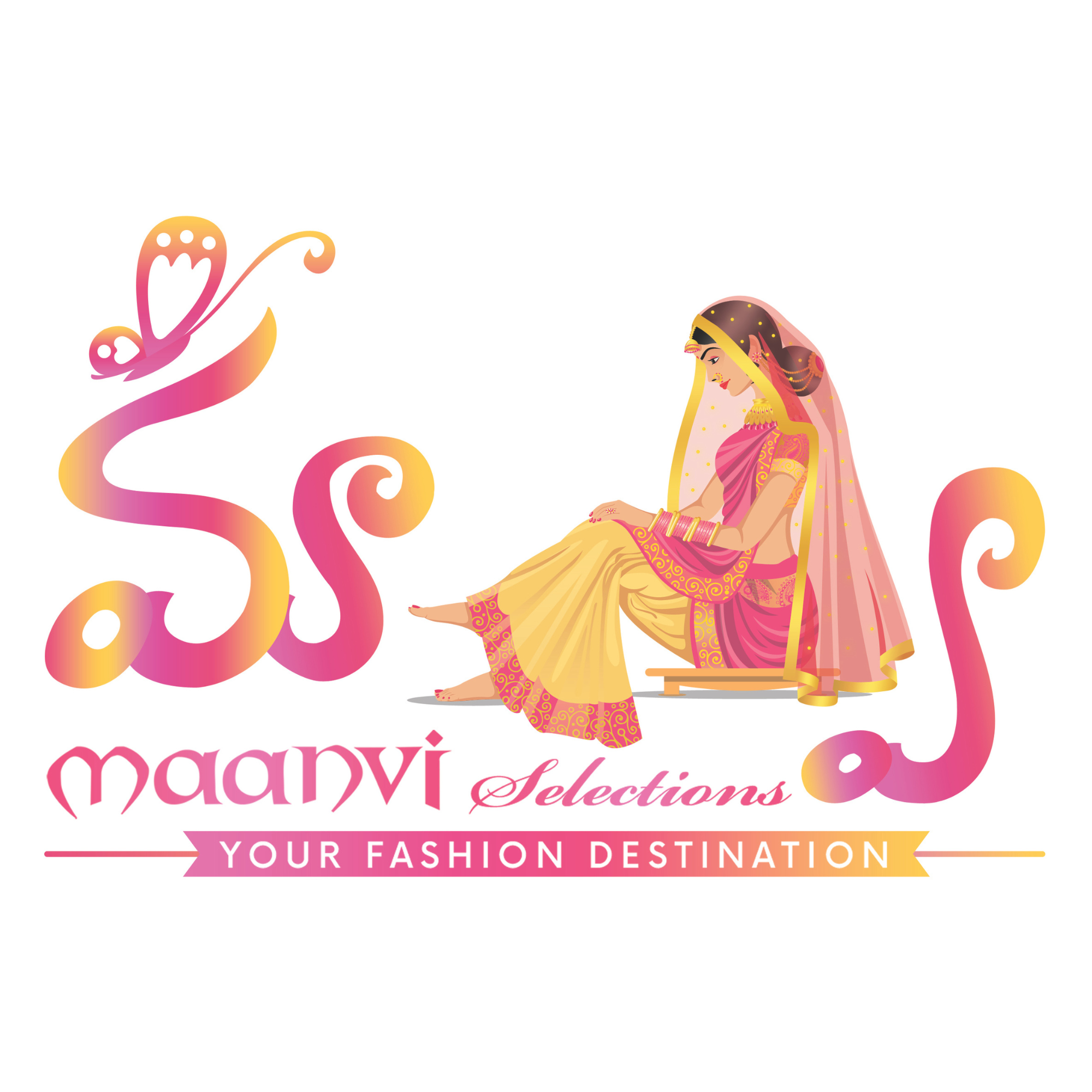
Maanvi Logo
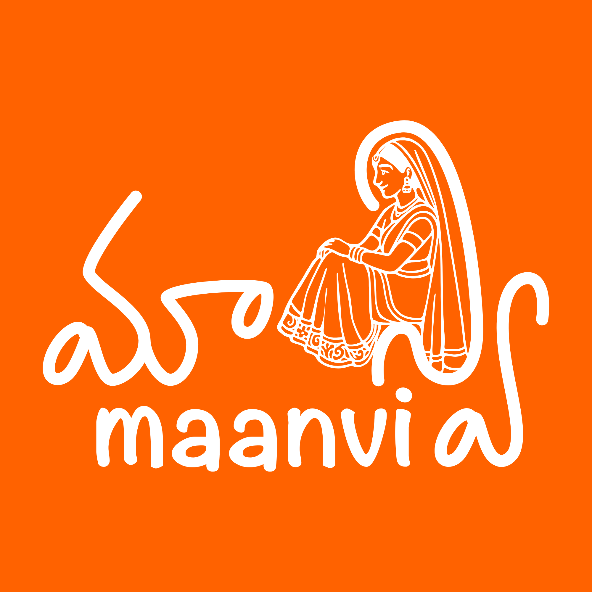
The evolution of a family boutique identity from its colorful 2017 mark to a clear monochrome Telugu emblem in 2025.
Maanvi is my parents’ boutique, so its identity grew with the business. The earliest logo came from an online logo generator: an MGM-inspired circle, an M where the lion might have been, and the boutique name set beside it. It worked because something was needed quickly, not because it truly belonged to the family.
My dad noticed that the silhouette of a seated bride could echo the Telugu letter Ni in Maanvi’s name. That observation gave the logo its real idea: the woman and the letter could become one shape.
I sketched the seated figure, and my illustrator cousin developed the color, filters, and decorative finish. The 2017 result was expressive and memorable, but it carried many colors and effects.
By 2025, those choices had become practical problems. Every printed bag, bill, sign, or billboard cost more in color, and the detailed mark could not adapt cleanly to every size or material.
The redesign removed the gradients and decoration, clarified the Telugu outline, and reduced the identity to one color. The bride is still present, but the letter now reads immediately, and the boutique can reproduce the mark almost anywhere.